How to Improve Your Launch Conversion Rate Step-by-Step
Stop Watching Your Traffic Bounce: How to Fix Your Launch Conversion
You spend three weeks building. Another week hyping it up on Twitter. Launch day finally hits. You sit at your desk, watching your real-time analytics spike to 500 active visitors.
Then, silence.
No Stripe notifications. No new user signups. Just a massive bounce rate and a sinking feeling in your gut. Sound familiar? Finding out how to improve your launch conversion rate is usually the difference between a project that pays rent and a domain you let expire in twelve months. Traffic means nothing if the bucket is leaking. Let us fix the leak.
How to Improve Your Launch Conversion Rate Quickly
Improving your launch conversion rate means aligning your hero messaging, establishing immediate social proof, and stripping every ounce of friction from your signup UX. You optimize for the user's specific intent rather than just explaining what your software does. This turns casual visitors into paying customers by making the "next step" feel entirely risk-free.
Step 1: Nail Your High-Intent Hero Section
Most founders make a massive mistake right at the top of the page. They build a brilliant app, then write a headline that reads like an API documentation snippet. Your visitors decide whether to stay or leave in about three seconds.
If they have to scroll down to figure out what you actually do, you have already lost them.
Writing Headlines That Sell the 'Transformation'
We naturally want to list features because we just spent a month coding them. But users do not buy features. They buy a better version of their own workflow.
Let's look at a quick before and after for an imaginary scheduling tool.
Before: "An AI-powered calendar assistant with OAuth integration."
After: "Stop double-booking meetings. Get your team's schedule synced in 30 seconds."
See the difference? The second one sells the outcome. If you are struggling with how to plan a startup launch that gains real traction, start by rewriting your headline to focus entirely on the transformation you provide to the end user.
The Power of a Single, Primary Call-to-Action
Hick's Law states that the more choices you give someone, the longer it takes them to make a decision. In practice, giving visitors five different buttons to click means they will click none of them.
I see landing pages with "Sign Up," "Read Docs," "View Pricing," and "Follow on Twitter" all competing in the hero section. Pick one primary goal.
If you want them to sign up, make the signup button a highly contrasting color. Everything else belongs in the footer or a minimal top navigation bar.
Step 2: Weaponize Social Proof and Trust Signals
Nobody wants to be the first person to eat at an empty restaurant. The same applies to SaaS. When you launch, you are a completely unknown entity with zero history.
So, how do you build credibility?
You borrow it. You need to show that other smart people have already vetted your product.
Making the Most of Beta Tester Testimonials
Generic praise is entirely useless. "Great app" tells a visitor nothing. You need specific, result-oriented quotes from early users.
Reach out to your beta testers and ask for numbers. Did your tool save them three hours a week? Did it help them close a client deal? Put that exact metric in quotes right below your primary call to action.
This directly combats new product skepticism. Concrete numbers prove the software works.
Showcasing Real-Time Activity and Logos
Social proof isn't just long-form testimonials. It is momentum.
Add a small badge near your signup button that says "Joined by 500+ builders." If you launched on a specific platform, include an "As seen on Product Hunt" badge. If your tool integrates with Notion or Stripe, put their familiar logos in a muted gray banner right below the fold. You instantly absorb some of their brand trust just by visual association.
Step 3: Create Strategic Urgency Without Being 'Salesy'
Figuring out how to improve your launch conversion rate often comes down to answering one quiet question for the user: "Why should I buy this today instead of next month?"
If there is no reason to act right now, they will bookmark your page and never return.
The Limited Early-Bird Pricing Model
Artificial urgency feels gross. Do not put a fake 15-minute countdown timer on your page that resets every time someone refreshes. People see right through that tactic.
Instead, use capacity-based scarcity.
Offer a lifetime deal or a 50% discount for the first 50 customers only. This forces a real decision. I often implement this when figuring out how to turn launch traffic into paying users because it rewards your earliest, most loyal supporters while creating genuine urgency.
Once those 50 spots are gone, cross the offer out and raise the price. That is it.
Step 4: Reduce Friction in the Signup Flow
You convinced them. They clicked the main button. Now you make them fill out a 10-field form, verify their email address, and complete a complex captcha.
They close the tab.
Your technical path from the landing page to the dashboard must be ruthlessly optimized. Every extra click drops your conversion rate by a measurable percentage.
Removing Unnecessary Form Fields
Audit your signup form right now. Do you really need their last name? Do you need their company size on day one?
According to research from Unbounce, reducing the number of form fields from 11 to 4 can increase conversions by 120%. Just ask for an email and a password. Better yet, use Google or GitHub OAuth so they can get in with a single click.
Get them into the app first. You can always ask for more profiling data later once they experience the core value.
4 Common Mistakes That Kill Launch Conversions
Even with a great product, small tactical errors can tank your big day. Here are a few pitfalls I see constantly.
Targeting everyone: "A productivity app for everyone" is a productivity app for no one. Speak directly to a specific niche, like freelance designers or backend devs.
Ignoring mobile optimization: Half your launch traffic will come from Twitter or Reddit on a phone. If your hero image breaks on a small screen, they will bounce instantly.
Burying the price: Stop making users create an account just to see how much your app costs. Put a clear, transparent pricing section on the landing page.
Slow page loads: If your site takes four seconds to hydrate because of massive unoptimized hero images, you are losing buyers. Use tools like Lighthouse to fix this before launch day.
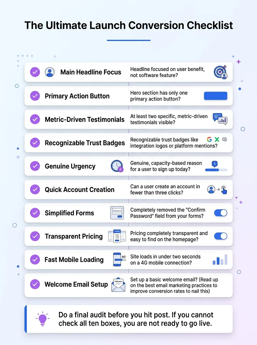
The Ultimate Launch Conversion Checklist
Do a final audit before you hit post. If you cannot check all ten boxes, you are not ready to go live.
Is the main headline focused on a user benefit rather than a software feature?
Does the hero section have only one primary, high-contrast action button?
Are there at least two specific, metric-driven testimonials visible?
Do you have recognizable trust badges like integration logos or platform mentions?
Is there a genuine, capacity-based reason for a user to sign up today?
Can a user create an account in fewer than three clicks?
Did you completely remove the "Confirm Password" field from your forms?
Is your pricing completely transparent and easy to find on the homepage?
Does the site load in under two seconds on a 4G mobile connection?
Did you set up a basic welcome email? (Read up on the best email marketing practices to improve conversion rates to nail this).
FAQ: Improving Your Launch Success
What is a good launch conversion rate?
For a typical SaaS landing page, converting 2% to 5% of unique visitors into free signups is solid. If you are selling a paid product directly, expect closer to 1% to 2%. Anything below 1% usually means you have a fundamental messaging or friction problem.
Should I offer a free trial during launch?
Yes, unless you are running a strictly limited lifetime-deal promo. A 7-day or 14-day trial removes the financial risk of trying a completely new tool. Just make sure you do not require a credit card upfront if you want to maximize those initial signups.
How long does a launch period actually last?
A launch is not a single 24-hour event. The initial spike happens on day one, but the real "launch window" lasts a full week as you actively promote across different communities, newsletters, and social channels.
Conclusion: Turn Your Launch Into a Growth Engine
Getting traffic is only half the battle. Learning how to improve your launch conversion rate ensures that your hard work actually translates into a sustainable user base.
Fix your headline, kill the friction, and give people a compelling reason to act right now. Optimization is iterative. Do not stress if the first hour is slow. Watch the analytics, adjust the copy, and keep tweaking.
And if you want a reliable place to test your messaging and get consistent eyeballs, platforms like WeekHack are built for this exactly. You get weekly product launches, community voting, and guaranteed dofollow backlinks from real makers. It is a fantastic way to maintain momentum long after the initial launch spike fades.
Written by

Jan Orsula
Serial maker and founder of WeekHack, SocialCal, and SocialOrbit. Builds tools that help creators launch side projects, schedule social media, and generate content — so they can focus on what matters.